About Me

My photo
http://www.youtube.com/ladymana93 http://wilsonsmedia2011.edublogs.org/ http://wilsonsmediamarkbook.edublogs.org/

Friday, 29 October 2010

RESEARCH - Certificate

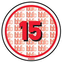
My film would contain nudity, which may not be such a big deal in modern society, so wouldn't effect the certificate too much. However it will be used in a sexual nature more likely. Also my film would contain drug use, this is okay but still prohibited. It is not allowed to promote or encourage it however. According the BBFC guidelines, my film is most likely to be a 15.
These are the following BBFC 15 rating guidelines:

Suitable only for 15 years and over

No one younger than 15 may see a ‘15’ film in a cinema. No one younger than 15 may rent or buy a ‘15’ rated video work.

Discrimination

The work as a whole must not endorse discriminatory language or behaviour.

Drugs

Drug taking may be shown but the film as a whole must not promote or encourage drug misuse. The misuse of easily accessible and highly dangerous substances (for example, aerosols or solvents) is unlikely to be acceptable.

Horror

Strong threat and menace are permitted unless sadistic or sexualised.

Imitable behaviour

Dangerous behaviour (for example, hanging, suicide and self-harming) should not dwell on detail which could be copied. Easily accessible weapons should not be glamorised.

Language

There may be frequent use of strong language (for example, ‘fuck’). The strongest terms (for example, ‘cunt’) may be acceptable if justified by the context. Aggressive or repeated use of the strongest language is unlikely to be acceptable.

Nudity

Nudity may be allowed in a sexual context but without strong detail. There are no constraints on nudity in a non-sexual or educational context.

Sex

Sexual activity may be portrayed without strong detail. There may be strong verbal references to sexual behaviour, but the strongest references are unlikely to be acceptable unless justified by context. Works whose primary purpose is sexual arousal or stimulation are unlikely to be acceptable.

Theme

No theme is prohibited, provided the treatment is appropriate for 15 year olds.

Violence

Violence may be strong but should not dwell on the infliction of pain or injury. The strongest gory images are unlikely to be acceptable. Strong sadistic or sexualised violence is also unlikely to be acceptable. There may be detailed verbal references to sexual violence but any portrayal of sexual violence must be discreet and have a strong contextual justification.
Thursday, 14 October 2010

RESEARCH - Analysis of a Teaser Trailer (Editing)

The titles during the Inception trailer appear to be coming towards the screen. This complements the sound and makes it seem as though something big is happening. It also relies on the reputation of the words on the screen. As they are meant to be enticing the viewer, so them words are meant to be of interest to them. For example the word 'Leonardo DiCaprio' on screen is meant to interest Leonardo DiCaprio fans.

The next set of titles have been used along with CGI. It is tilted on its axis as if gravity isn't present. This may have something to do with the plot of the film. Also again complemented with the sound, it builds up more tension as it is moving at high speed.

The trailer ends with more CGI and it appears the word Inception is made out of buildings. Again this is an aspect of the film. This is clearly there to mainly tell you the title of the film.


Friday, 8 October 2010

RESEARCH - Analysis of a Teaser Trailer (Sound)

The trailers music was composed by a different person to the composer of the actual film. Zack Hemsey is a specialist at orchestrating music for trailers, therefore the music was made specially for them images and complements them very well. I believe the music is the most effective aspect to the trailer. It builds up the suspense greatly and leaves the viewer very confused and wanting more. The speed of the sound gradually gets faster, as well as its volume. This is when it builds on tension at its best. It does this before it finally ends towards the finale of the trailer.

Monday, 4 October 2010

RESEARCH - Analysis of a Teaser Trailer (Camera Angles and Movement)

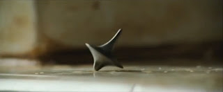
The main camera angle used throughout the teaser trailer is a close up. It is used to focus on unique features of the film. First of all the camera focus' on a weird object spinning. The shots may mean nothing to the viewer, however it is complemented well with the music to make it seem or more importance. This is the same for all the other shots.


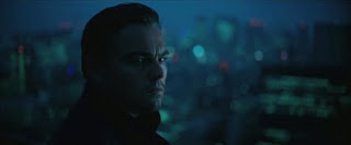
The next shot is a close up of Leonardo DiCaprio's face. He is a big actor so this alone is a great selling point. This is a reaction shot, we can see that he looks uneasy. This builds up even more tension. The main unique selling point of the film is its gravity defying effects. The next two shots after are also like this. It is a close up of a glass of water, however the water moves as if there is no gravity. This would be very strange to the viewer and intrigue them even more.
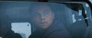
There is another close up shot of Leonardo DiCaprio. It is also a reaction shot, this confirms him as the protagonist in the film. He is a big actor, and this is one thing that is given away. Nothing much else about the characters or storyline is given away in the trailer.

As the music gets faster, so does the cut the next shot. There are many quick close ups of slow motion, gravity defying action scenes. This will draw the viewer in as it is very unique, and will interest the films main target audience. After the quick action shot, there is a shot of someone jumping out of water. This increases the confusion, hopefully leaving the viewer aching for more.

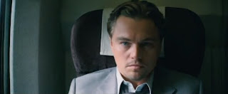


The trailer ends with another close up, reaction shot of the main protagonist. It shows him waking up, as if everything that has happened in the trailer so far was in a dream?


Thursday, 30 September 2010

RESEARCH - Software

MAGAZINE AND POSTER

For my magazine front cover and movie poster the main piece of software I will need is Adobe Photoshop. It has various features including the colour replacement tool, the magic wand and other more sophisticated features. It is better then Microsoft Publisher as I can do much more with the piece and make it look more professional. The previous tools I have mentioned are more for the image, however the features available for me to manipulate my masthead are much better then Publisher too. I have many more fonts to choose from and once I have done that I can add many effects to it. These effects include a stroke, inner glow, outer glow and many more.

TEASER TRAILER

For my teaser trailer I have chosen to use Final Cut, rather then IMovie as it is more professional and has more features. There are much more levels of audio and video I can use as well as more features, for example the chroma key. For the credits and title of the movie, I will use LiveType. This is an easy way to add text to the video as well as adding effects to it. Finally if I want to add special effects I will use Adobe After Effects, this will make the effects look more realistic and add depth to my final piece.

Monday, 27 September 2010

RESEARCH - What is a Teaser Trailer?

A teaser trailer is a short trailer used to advertise the release of an upcoming film or tv show. Unlike a normal trailer, it is much shorter, typically between 30 and 60 seconds. Also unusually like normal trailers it contains little, if any footage from the film/show.

Friday, 24 September 2010

RESEARCH - Analysis of a Movie Poster

As a poster is usually bigger then a magazine front cover and is used to sell the film, it doesn't follow the same conventions. It is trying to sell only one thing and as it will be much bigger, it will try to fit in as much about the film as it can.

Posters of films typically show the best reviews about the film and awards they have recieved. This is to show its critically acclaimed and to boost the appeal to more audiences.

If there is a well known cast in the film then this is typically displayed on the poster in a big font. This is again to boost appeal to those who are a fan of that cast member.

A tag line can also be seen on the poster, this is so we have some idea about what the film is about, without giving too much away.

In this poster we can see all the cast, underneath the title of the film. By seeing the cast we get a good idea about what the film is about. The title of the film is also in a big bold font, in red, white and blue. The colours along with the title of the film denote that it is based in England.

Finally the law of thirds is mainly applied here, as the heads of the characters and the title of the film intercept the imaginary lines. The law of z is also applied if you read along the award mentions at the top, across the title of the film and back across the cast.

Tuesday, 21 September 2010

RESEARCH - Analysis of Movie Magazine Front Page

Empire magazine is the UK's leading movie magazine so there is a degree of arrogance in their front page. An example being that they are such a successful brand, that they dont even need to show their masthead in full. In this picture we can see the main figures head is covering the 'P' in 'EMPIRE'. Despite this it still shows many common magazine features.

It has a bold masthead, there is no glow to it and it is in bold. The colour it uses is also the classic red of 'Empire', it also contrasts all the other colours on the page so it stands out. Due to these reasons its easy to see and the consumer knows what magazine they are buying.

To increase the appeal the magazine has an exclusive. This is featured above the title. An exclusive means that no other magazine will have the information that they do. This is put above the masthead, as they believe it to be such a massive appeal to that particular issue.

There are also various puffs on the page. They fit with the general green, purple, white colour scheme. However they manage to contrast the background, so they stand out easy for the consumer to see. This again is to boost appeal and so quite simply the reader knows what stories are inside the magazine.

Finally you can see the law of thirds and z are applied, as the main parts of the image intersect the imaginary vertical and horizontal lines. Also if you follow the masthead, then the main picture, back across to the puffs in the right hand corner you can see the law of z is applied.

Friday, 17 September 2010

RESEARCH - Z Rule

In our culture when we read, we usually go from left to right. Then back down to the left and to the right again. This is in the shape of a 'Z'. Therefore the 'Z' rule is when the main parts of the image are in a 'Z' shape. This is because these are the parts we tend to look at in more detail.

Tuesday, 14 September 2010

RESEARCH - Rule of Thirds

This is a rule applied to designs including magazine front covers, or movie posteres. The rule is that an image should be seperated into nine sections by two horizontal lines, and two vertical lines all equally spaced apart. It states that the main components of the picture should intersect the lines. This rule is applied as apparently it adds more tension, energy and interest to the image.