About Me

My photo
http://www.youtube.com/ladymana93 http://wilsonsmedia2011.edublogs.org/ http://wilsonsmediamarkbook.edublogs.org/

Wednesday 29 December 2010

PLANNING - Production Logo


My production logo background appears to be a 'fuzzy' TV screen. This has connotations of the film industry which is why I used this. Like all the other production logos I have looked at, the writing is clear to see and is in a basic font. This is what I have gone for. Hopefully with the TV background and the writing it is clear that this is a production logo.

Friday 10 December 2010

PLANNING - Mock Magazine Final

This is my final mock magazine. When it comes to my real
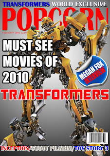
magazine I will obviously change the main picture and the
wording of the mastheads.

As we can see the magazine has a Z pattern along the main masthead, diagonally across the main picture and back across the bottom cover lines.

I have drew inspiration from other film magazines with the layout and the red masthead. This helped me make it look more professional. I have followed typical conventions for example, it has a masthead, cover lines, a pug, an exclusive and a main picture.

We can see that I have taken into account what the focus group has said as I have reworded my cover lines, changed the strokes and changed the pug to make it look more authentic.

My masthead is very big, bold and basic. This is so it stands out and is easy to read. It has to be easy to read as it is the title of the magazine and people need to know what they are reading. The title 'Popcorn' has film connotations too, this complemented with the main image and cover lines should make it obvious to readers that the magazine is about movies. The masthead is also in red which contrasts the background which also adds to it standing out.

All my cover lines stand out and are spread across the page to fit the Z pattern. This is so that it follows the standard eye line and people can easily read whats inside the magazine. This is to attract the reader. Each cover line has a stroke to make it stand out even more. I also have an exclusive at the top of the screen; this means that only this magazine has that information to make it different from any other magazine. It is above the masthead to prove how important it is. There is a pug on the magazine in the form of a peeling sticker, this is if its coming off the page. This is a design feature to make it more eye catching, it also contains information that will make the magazine more appealing. I have also used typical magazine conventions by putting the date and price of the magazine underneath the masthead. However I decided against a tag line as there is no space plus it is obvious that my magazine is about films.

Finally my image takes up most of the magazine front page and is in the centre so the attention is directed at it. There is no background image, this makes it stand out even more. However I didn't want to leave it bare so I added a gradient to it.

Thursday 2 December 2010

PLANNING - Mock Magazine Focus Group

I formed a focus group among 13 of my peers. I wanted them to look at a basic magazine cover I had made and give me advice on it. These are the comments they came up with:

- Needs a tag line
- Pug looks tacky
- Change font
- Reword mastheads
- Change colour and thickness of strokes
- Bar code is too big
- Move masthead higher

Tuesday 30 November 2010

RESEARCH - Target Audience

According to the VALS I believe our target audience is Actualizers and Strivers. They are both similar and the main aspect of their characteristics which is appropriate to our trailer is their youth. They also like their independence and like to be different, which is similar of the characteristics of the characters in our show.

From the LifeMatrix our target audience us the tribe wired fun/actics, again cos of their youth but also because of their activeness and free spirit.

Friday 26 November 2010

RESEARCH - Media Theory

Cultivation Theory - This means that the effect grows on the world gradually and multiplies even if you don't watch TV. As most people in the world watch TV, it suggests some are bound to be effected by this. Then they will act 'effected' socially around other people, which means they will be effected and then the process will never stop.


David Gauntlett


Key Idea: He suggests that the original way of teaching media fails to recognise the changing media landscape. This idea is called Media 2.0. He also dismisses the effects theory and has made 10 points to deal with why society aren't directly effected by television.


Most Important Article: 2007, media 2.0


Quote: 'its all about how we gather and develop knowledge about the social world: the very heart of social science'


My comment: He's right, media is a subject that is constantly changing and with change we need new ideas to counteract the progression of the industry.


Dafna Lemish


Key Idea: That children are effected by western culture through the television. However there are many reasons for this, the main one being globalisation.


Most Important Book: Journal of Children and Media


My comment: I agree with her to an extent, that children usually go with the crowd and will be effected by what they like. However they are not as ignorant as they are percieved in the effects theory, and that I still think they know the balance between right and wrong.

Saturday 20 November 2010

RESEARCH - Propps Narrative Theory

Villain - Frank D'Amico
Donor - Big Daddy
Helper - Big Daddy
Princess - Katie
Dispatcher - Red mist
Hero - Hit Girl
False Hero - Kick-Ass

Sunday 14 November 2010

RESEARCH - Moral Panic - Sex Trafficking

There has been a lot of panic about the growing spread of sex trafficking. Political and pressure groups have been calling for investigations into this issue, they have presented facts detailing the depth of this problem. However, where did they get these facts from?

Newspapers reported that 'hundreds' of mail order wives were being shipped form Albania to the UK. However, is this sex trafficking? These women have come on their own accord and decided to marry these men. They also stated that women who were mail ordered within the same country were being sex trafficked. Another example of a slippery slope is the announcement that the true scale of the problem was between 2 and 20 times that was previously confirmed. The difference between these two numbers is huge and vague. Therefore, they don't have any idea. Also, a group called CHASTE claimed 1,420 women were being sex trafficked, this figure was then quoted in newspapers. In the end the figure turned out to be a lie. Finally, this group also announced that every foreign woman in Soho and every foreign woman in the UK was a victim of sex trafficking. This too, was a completely false, stereotypical assumption.

Therefore, this panic was spread through lies and assumptions.

Monday 8 November 2010

RESEARCH - UK Privacy Law

1990

The case involved Gorden Kaye, a well known actor who suffered life threatening injuries in a car accident. Kaye attempted to obtain an order to restrain publication of photographs of the injuries he suffered in the crash. These photographs were obtained by deception when a tabloid journalist entered the hospital while he was undergoing treatment.

A friend of Mr Kaye had been granted an interlocutory injunction preventing the editor (Anthony Robertson) and the newspaper (the Sunday Sport) from using the material, which they appealed.

Lord Justice Glidewell said "It is well-known that in English law there is no right to privacy, and accordingly there is no right of action for breach of a persons privacy. The facts of the present case are a graphic illustration of the desirability of Parliament considering whether and in what circumstances statutory provision can be made to protect the privacy of individuals."

In the absence of the right to privacy, Mr Kaye's advisers based their claim on libel, malicious falsehood, trespass to the person and passing off. The Court of Appeal ruled that none of these torts was applicable except malicious falsehood, and on this basis the only remedy available was that the newspaper was prohibited from stating any inference that Mr Kaye had consented to the story.

The academic response to this ruling has been negative, e.g. "Kaye remains a compelling demonstration of the limits of both existing English law and of the limitations of an approach that relies upon inadequate existing remedies to protect privacy."


1998-2000

The Human Rights Act 1998 is an Act of Parliament of the United Kingdom which received Royal Assent on 9 November 1998, and mostly came into force on 2 October 2000. Its aim is to "give further effect" in UK law to the rights contained in the European Convention on Human Rights. The Act makes available in UK courts a remedy for breach of a Convention right, without the need to go to the European Court of Human Rights in Strasbourg. It also totally abolished the death penalty in UK law (although this was not required by the Convention in force for the UK at that time)


2008

In 2008 the editor of the Daily Mail criticised the Human Rights Act for allowing, in effect, a right to privacy at English law despite the fact that Parliament has not passed such legislation. Paul Dacre was in fact referring to the indirect horizontal effect of the Human Rights Act on the doctrine ofbreach of confidence which has moved English law closer towards a common law right to privacy.In response the Lord Chancellor Lord Falconer stated that the Human Rights Act had been passed by Parliament, that people's private lives needed protection and that the judge in the case had interpreted relevant authorities correctly


2011

It has become apparent that many rich and powerful people are taking out injunctions or super injunctions. This has raised the argument, do the public have a right to know, or do the celebrities have a right to privacy.

Tuesday 2 November 2010

RESEARCH - Roland Barthes

The Hermeneutic Code (HER)
The
Hermeneutic Code refers to any element of the story that is not fully explained and hence becomes a mystery to the reader.
The full truth is often avoided, for example in:
Snares: deliberately avoiding the truth.
Equivocations: partial or incomplete answers.
Jammings: openly acknowledge that there is no answer to a problem.
The purpose of the author in this is typically to keep the audience guessing, arresting the enigma, until the final scenes when all is revealed and all loose ends are tied off and
closure is achieved.
The Proairetic Code (ACT)
The
Proairetic Code also builds tension, referring to any other action or event that indicates something else is going to happen, and which hence gets the reader guessing as to what will happen next.
The Hermeneutic and Proairetic Codes work as a pair to develop the story's tensions and keep the reader interested. Barthes described them as:
"...dependent on ... two sequential codes: the revelation of truth and the coordination of the actions represented: there is the same constraint in the gradual order of melody and in the equally gradual order of the narrative sequence."
The Semantic Code (SEM)
This code refers to
connotation within the story that gives additional meaning over the basic denotative meaning of the word.
It is by the use of extended meaning that can be applied to words that authors can paint rich pictures with relatively limited text and the way they do this is a common indication of their writing skills.
The Symbolic Code (SYM)
This is very similar to the Semantic Code, but acts at a wider level, organizing semantic meanings into broader and deeper sets of meaning.
This is typically done in the use of antithesis, where new meaning arises out of opposing and conflict ideas.
The Cultural Code (REF)
This code refers to anything that is founded on some kind of canonical works that cannot be challenged and is assumed to be a foundation for truth.
Typically this involves either science or religion, although other canons such as magical truths may be used in fantasy stories. The Gnomic Codeis a cultural code that particularly refers to sayings, proverbs, clichés and other common meaning-giving word sets.

Friday 29 October 2010

RESEARCH - Certificate

My film would contain nudity, which may not be such a big deal in modern society, so wouldn't effect the certificate too much. However it will be used in a sexual nature more likely. Also my film would contain drug use, this is okay but still prohibited. It is not allowed to promote or encourage it however. According the BBFC guidelines, my film is most likely to be a 15.
These are the following BBFC 15 rating guidelines:

Suitable only for 15 years and over

No one younger than 15 may see a ‘15’ film in a cinema. No one younger than 15 may rent or buy a ‘15’ rated video work.

Discrimination

The work as a whole must not endorse discriminatory language or behaviour.

Drugs

Drug taking may be shown but the film as a whole must not promote or encourage drug misuse. The misuse of easily accessible and highly dangerous substances (for example, aerosols or solvents) is unlikely to be acceptable.

Horror

Strong threat and menace are permitted unless sadistic or sexualised.

Imitable behaviour

Dangerous behaviour (for example, hanging, suicide and self-harming) should not dwell on detail which could be copied. Easily accessible weapons should not be glamorised.

Language

There may be frequent use of strong language (for example, ‘fuck’). The strongest terms (for example, ‘cunt’) may be acceptable if justified by the context. Aggressive or repeated use of the strongest language is unlikely to be acceptable.

Nudity

Nudity may be allowed in a sexual context but without strong detail. There are no constraints on nudity in a non-sexual or educational context.

Sex

Sexual activity may be portrayed without strong detail. There may be strong verbal references to sexual behaviour, but the strongest references are unlikely to be acceptable unless justified by context. Works whose primary purpose is sexual arousal or stimulation are unlikely to be acceptable.

Theme

No theme is prohibited, provided the treatment is appropriate for 15 year olds.

Violence

Violence may be strong but should not dwell on the infliction of pain or injury. The strongest gory images are unlikely to be acceptable. Strong sadistic or sexualised violence is also unlikely to be acceptable. There may be detailed verbal references to sexual violence but any portrayal of sexual violence must be discreet and have a strong contextual justification.

Thursday 14 October 2010

RESEARCH - Analysis of a Teaser Trailer (Editing)

The titles during the Inception trailer appear to be coming towards the screen. This complements the sound and makes it seem as though something big is happening. It also relies on the reputation of the words on the screen. As they are meant to be enticing the viewer, so them words are meant to be of interest to them. For example the word 'Leonardo DiCaprio' on screen is meant to interest Leonardo DiCaprio fans.

The next set of titles have been used along with CGI. It is tilted on its axis as if gravity isn't present. This may have something to do with the plot of the film. Also again complemented with the sound, it builds up more tension as it is moving at high speed.

The trailer ends with more CGI and it appears the word Inception is made out of buildings. Again this is an aspect of the film. This is clearly there to mainly tell you the title of the film.


Friday 8 October 2010

RESEARCH - Analysis of a Teaser Trailer (Sound)

The trailers music was composed by a different person to the composer of the actual film. Zack Hemsey is a specialist at orchestrating music for trailers, therefore the music was made specially for them images and complements them very well. I believe the music is the most effective aspect to the trailer. It builds up the suspense greatly and leaves the viewer very confused and wanting more. The speed of the sound gradually gets faster, as well as its volume. This is when it builds on tension at its best. It does this before it finally ends towards the finale of the trailer.

Monday 4 October 2010

RESEARCH - Analysis of a Teaser Trailer (Camera Angles and Movement)

The main camera angle used throughout the teaser trailer is a close up. It is used to focus on unique features of the film. First of all the camera focus' on a weird object spinning. The shots may mean nothing to the viewer, however it is complemented well with the music to make it seem or more importance. This is the same for all the other shots.


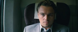
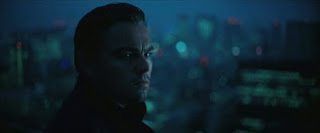
The next shot is a close up of Leonardo DiCaprio's face. He is a big actor so this alone is a great selling point. This is a reaction shot, we can see that he looks uneasy. This builds up even more tension. The main unique selling point of the film is its gravity defying effects. The next two shots after are also like this. It is a close up of a glass of water, however the water moves as if there is no gravity. This would be very strange to the viewer and intrigue them even more.

There is another close up shot of Leonardo DiCaprio. It is also a reaction shot, this confirms him as the protagonist in the film. He is a big actor, and this is one thing that is given away. Nothing much else about the characters or storyline is given away in the trailer.

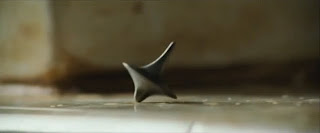
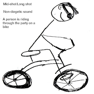
As the music gets faster, so does the cut the next shot. There are many quick close ups of slow motion, gravity defying action scenes. This will draw the viewer in as it is very unique, and will interest the films main target audience. After the quick action shot, there is a shot of someone jumping out of water. This increases the confusion, hopefully leaving the viewer aching for more.


The trailer ends with another close up, reaction shot of the main protagonist. It shows him waking up, as if everything that has happened in the trailer so far was in a dream?


Thursday 30 September 2010

RESEARCH - Software

MAGAZINE AND POSTER

For my magazine front cover and movie poster the main piece of software I will need is Adobe Photoshop. It has various features including the colour replacement tool, the magic wand and other more sophisticated features. It is better then Microsoft Publisher as I can do much more with the piece and make it look more professional. The previous tools I have mentioned are more for the image, however the features available for me to manipulate my masthead are much better then Publisher too. I have many more fonts to choose from and once I have done that I can add many effects to it. These effects include a stroke, inner glow, outer glow and many more.

TEASER TRAILER

For my teaser trailer I have chosen to use Final Cut, rather then IMovie as it is more professional and has more features. There are much more levels of audio and video I can use as well as more features, for example the chroma key. For the credits and title of the movie, I will use LiveType. This is an easy way to add text to the video as well as adding effects to it. Finally if I want to add special effects I will use Adobe After Effects, this will make the effects look more realistic and add depth to my final piece.

Monday 27 September 2010

RESEARCH - What is a Teaser Trailer?

A teaser trailer is a short trailer used to advertise the release of an upcoming film or tv show. Unlike a normal trailer, it is much shorter, typically between 30 and 60 seconds. Also unusually like normal trailers it contains little, if any footage from the film/show.

Friday 24 September 2010

RESEARCH - Analysis of a Movie Poster

As a poster is usually bigger then a magazine front cover and is used to sell the film, it doesn't follow the same conventions. It is trying to sell only one thing and as it will be much bigger, it will try to fit in as much about the film as it can.

Posters of films typically show the best reviews about the film and awards they have recieved. This is to show its critically acclaimed and to boost the appeal to more audiences.

If there is a well known cast in the film then this is typically displayed on the poster in a big font. This is again to boost appeal to those who are a fan of that cast member.

A tag line can also be seen on the poster, this is so we have some idea about what the film is about, without giving too much away.

In this poster we can see all the cast, underneath the title of the film. By seeing the cast we get a good idea about what the film is about. The title of the film is also in a big bold font, in red, white and blue. The colours along with the title of the film denote that it is based in England.

Finally the law of thirds is mainly applied here, as the heads of the characters and the title of the film intercept the imaginary lines. The law of z is also applied if you read along the award mentions at the top, across the title of the film and back across the cast.

Tuesday 21 September 2010

RESEARCH - Analysis of Movie Magazine Front Page

Empire magazine is the UK's leading movie magazine so there is a degree of arrogance in their front page. An example being that they are such a successful brand, that they dont even need to show their masthead in full. In this picture we can see the main figures head is covering the 'P' in 'EMPIRE'. Despite this it still shows many common magazine features.

It has a bold masthead, there is no glow to it and it is in bold. The colour it uses is also the classic red of 'Empire', it also contrasts all the other colours on the page so it stands out. Due to these reasons its easy to see and the consumer knows what magazine they are buying.

To increase the appeal the magazine has an exclusive. This is featured above the title. An exclusive means that no other magazine will have the information that they do. This is put above the masthead, as they believe it to be such a massive appeal to that particular issue.

There are also various puffs on the page. They fit with the general green, purple, white colour scheme. However they manage to contrast the background, so they stand out easy for the consumer to see. This again is to boost appeal and so quite simply the reader knows what stories are inside the magazine.

Finally you can see the law of thirds and z are applied, as the main parts of the image intersect the imaginary vertical and horizontal lines. Also if you follow the masthead, then the main picture, back across to the puffs in the right hand corner you can see the law of z is applied.

Friday 17 September 2010

RESEARCH - Z Rule

In our culture when we read, we usually go from left to right. Then back down to the left and to the right again. This is in the shape of a 'Z'. Therefore the 'Z' rule is when the main parts of the image are in a 'Z' shape. This is because these are the parts we tend to look at in more detail.

Tuesday 14 September 2010

RESEARCH - Rule of Thirds

This is a rule applied to designs including magazine front covers, or movie posteres. The rule is that an image should be seperated into nine sections by two horizontal lines, and two vertical lines all equally spaced apart. It states that the main components of the picture should intersect the lines. This rule is applied as apparently it adds more tension, energy and interest to the image.