This is my final mock magazine. When it comes to my real
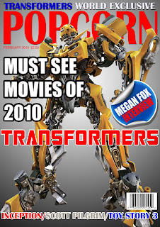
magazine I will obviously change the main picture and the
wording of the mastheads.
As we can see the magazine has a Z pattern along the main masthead, diagonally across the main picture and back across the bottom cover lines.
I have drew inspiration from other film magazines with the layout and the red masthead. This helped me make it look more professional. I have followed typical conventions for example, it has a masthead, cover lines, a pug, an exclusive and a main picture.
We can see that I have taken into account what the focus group has said as I have reworded my cover lines, changed the strokes and changed the pug to make it look more authentic.
My masthead is very big, bold and basic. This is so it stands out and is easy to read. It has to be easy to read as it is the title of the magazine and people need to know what they are reading. The title 'Popcorn' has film connotations too, this complemented with the main image and cover lines should make it obvious to readers that the magazine is about movies. The masthead is also in red which contrasts the background which also adds to it standing out.
All my cover lines stand out and are spread across the page to fit the Z pattern. This is so that it follows the standard eye line and people can easily read whats inside the magazine. This is to attract the reader. Each cover line has a stroke to make it stand out even more. I also have an exclusive at the top of the screen; this means that only this magazine has that information to make it different from any other magazine. It is above the masthead to prove how important it is. There is a pug on the magazine in the form of a peeling sticker, this is if its coming off the page. This is a design feature to make it more eye catching, it also contains information that will make the magazine more appealing. I have also used typical magazine conventions by putting the date and price of the magazine underneath the masthead. However I decided against a tag line as there is no space plus it is obvious that my magazine is about films.
Finally my image takes up most of the magazine front page and is in the centre so the attention is directed at it. There is no background image, this makes it stand out even more. However I didn't want to leave it bare so I added a gradient to it.