About Me

My photo
http://www.youtube.com/ladymana93 http://wilsonsmedia2011.edublogs.org/ http://wilsonsmediamarkbook.edublogs.org/

Friday, 25 March 2011

PRODUCTION - Montage Editing

For my teaser trailer I will be using Montage editing, this is because I want my trailer to be fast paced and the shots to quickly change. It is defined as "the juxtaposition of such successive shots as a cinematic technique whereas continuity a style of editing marked by its emphasis on maintaining a continuous and seemingly uninterrupted flow of action".

As my trailer is of a party scene, I want the pace of the trailer to be fast. I can achieve this with quick cuts via montage editing.


Friday, 18 March 2011

PRODUCTION - Poster Production Time Line
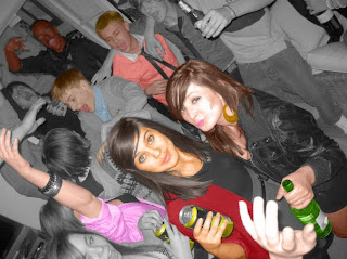


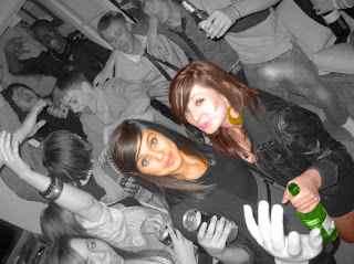
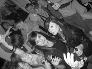
This shows the process I went through of colouring in the people in the photo. We got a number of people round my house. We then staged a party, with two of the main characters at the front of the poster. After this I edited them and turned them into colour, mainly using the colour replacement tool.


Monday, 28 February 2011

PRODUCTION - Special Effects (Vomiting Scene)

Our film won't need many special effects. However, the one scene that needed it we decided to film first. The only special effect we needed was the vomiting scene. To do this we needed to use an empty milk carton, gaffer tape and a washing machine hose. We then blended up random foods and poured them into the milk carton. Once in the milk carton we gaffer taped the milk carton to his side, whilst the washing machine hose led from the carton to his mouth. Once this was in place, we started filming. The actor bent over whilst making sick noises and squeezed the milk carton. This then made the blended up mixture pour through the hose and out the end. From the side this actually appears as if the actor is throwing up.


Wednesday, 23 February 2011

PLANNING - Music Rights

We were given permission by EMI records to use 'Blur - Girls and Boys' in our teaser trailer as it was for educational purposes, however, the emails between us and EMI are confidential. Therefore, they cannot be shown on my blog, however, our teacher can confirm we have permission.

Tuesday, 15 February 2011

PLANNING - Title Sequence

Last year I used LiveType for my title sequence. However, I believe the choice of effects was very limited so I went for another program. I decided to use Adobe After Effects CS3. This allows me to do much more realistic effects, as well as it being easier to use.

The title sequence will start with the production logos. Both of these will have simple of effects on them. Just to have them appear on screen in a unique way and it will have to hold for a few seconds.

The second to last title sequence will be the title of the film. This will be more unique then all other credits shown. This is because this is the title of the film which people will have to remember. The idea is to make sure it sticks in their mind. Therefore, we will use the same effect for the text to appear on screen. However, we will use some sort of energy effect behind it.

Finally, the last title will be the words 'Coming Soon'. This will have the same effect as the production logos.

We will wait till after we have all the footage before we use any other titles in the middle of the teaser trailer.

Saturday, 5 February 2011

PLANNING - Poster Ideas
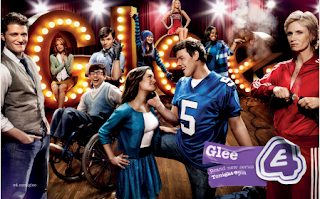
I was lucky enough this summer to work at Channel 4 as part of my work experience. I worked in the 4 creative department which make the posters for the shows. Whilst I was there my first task was to go on the website and look at there past works. From this I gained inspiration.


As we can see in this picture of glee, the people have been photoshopped to make them look more colourful. I liked this effect as it made them stand out more. Also whilst at channel 4 I was there when they were making the 'This is England '80' posters. I found out they made grayscales of each picture. From this I thought maybe from the grayscale they coloured in each individual person, so this is what I plan to do.


Also many films these days make character posters for the film. This is what me and my partner want to do, we will make a character poster each.


We feel that doing this will be more original and different to most posters, so will go for this idea.

Tuesday, 1 February 2011

PLANNING - Location
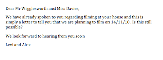
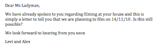
We have chosen to set our teaser trailers in two different locations. However both locations have similar layouts and are in similar areas. They are both in Wimbledon, thus its easy to travel from one location to another. It also allows us the freedom to film in more words, obviously this will have to take into account good editing on our behalves, but we believe that this can be achieved. Below are pictures of the settings and letters to the owners of the house to gain permission.


Thursday, 27 January 2011

PLANNING - Title and Font Focus Group
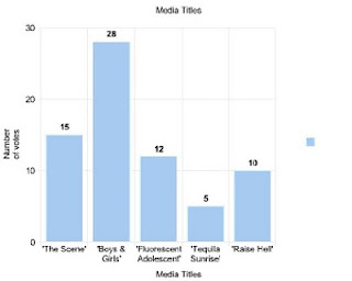
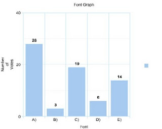
We were unsure of the title of the film and the font we should use. So we managed to organise a focus group of 70 people form our target audience. Firstly, we asked what they think the title of the film should be. The results are as follows:

From this graph we can see clearly that the favourite title was 'Boys & Girls'. After this was decided we designed the word in many different fonts. We then asked the same focus group what they thought was the best font. Here are the results:
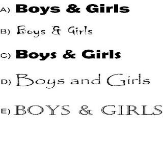
We can see clearly form the second set of results, that the favoured font was font A).


Thursday, 20 January 2011

PLANNING - Music

I have looked at a similar trailer that is going to be part of our inspiration and it is clear that the music complements whats on screen and should make it clear that the trailer is more modern. It should have clubbing connotations. This is because clubbing songs are more associated with dancing. Also the synth and other more dance music instruments i.e. a Kaos Pad, are closely linked to the 21st century. Bands that have inspired us have included, Magnetic Man, Justice, Crystal Castles.


Saturday, 15 January 2011

PLANNING - Casting

I held auditions at my house and invited a number of people to it. I either gave them actions to do or lines to say. From the auditions I decided who would be more of a main focus and who would be an extra. The cast includes:

- Adam Worsley: Kissing boy
- Hannah Arnold: Kissing girl
- James Ross-Dreher: Sick boy
- Izzie Cheeseman: Party Girl (On poster)
- Hannah Tebbutt: Party Girl (On poster)

Sunday, 9 January 2011

PLANNING - Outfits

The outfits will be based on modern styles. Most of the actors in the film have clothes I am happy with, however I will help pick out what they wear. This is a good piece of mise-en-scene which shall prove effective in making the teaser look more authentic. I have looked at many websites including www.topman.com and www.topshop.com for inspiration, as well as looking at famous teenagers for more inspiration.

Monday, 3 January 2011

PLANNING - Film concepts

Our film is about the lives of adolescents living in England. Obviously it is a dramatisation for entertainment purposes. It has proved popular in TV drama recently, so this is an attempt to adapt this genre onto the big screen. Recent successful examples have been Misfits, Inbetweeners and Skins. The teaser trailer isn't meant to give much away about the film so none of the plot is given away during it. The teaser trailer will be a party with a lot of quick editing between each shots. The teaser will require a minimum of 10 different cast members to make the party seem more authentic.